I am back from my Diwali Holidays and it was fun especially if you belong to Delhi. My parents shifted to a new house recently. So naturally this Diwali was spent in introducing me to the new neighbors. There is a signature style of talking that distinguishes a Delhite from a non Delhite and it goes like this. And here goes Iphone to my rescue.
// Neighbour of my age who is a programmer in Delhi //
Smartass Boy: So what do you do in Haiderabad... are you a programmer?
Me: No I am a User Interface Designer (hoping that he understands.. but no)
Smartass Boy: I didn't get it... (next question is the typical question they ask when they don't understand anything)...ahaan.. konse pletform par kaam karte ho?
Me: (platform no. 12 coolie no. 420).. actually our job is platform independent..
(Not so)Smartass Boy: (Now that all his concepts are shaken..aggressively) Now does you application run on Java or .Net?????
Me: I design how users will interact with the product... on the desired platform (I add this extra bit for his convenience).
(Not so)Smartass Boy: Accha (ye to bavakoofon ka kaam hoga) to aap GUI banate ho? ... Koi course kar rakha hai ismein??
Me: (yea that's wat girls do right..course!! wtf) I studied in NID, Ahmedabad and the "course" is called Software and User Interface Design..
(Not so)Smartass Boy: GUI design (in a comtemplating pose as if he is the personal advisor of Narayan Moorthy) .. hmm.. ye to bada easy kaam hai... ismein aapne course kiya??
Me: (no... i just went to NID to make out with my BF).. itna easy nahin hai... we measure and improve the usability of the product...it requires user research and design skills.. its the basic difference between an iPhone and any other phone.
Smartass Boy: (happy on listening about iPhone).. iPhone! My friend just came from US and got an iPhone...u should see it... its amazing... blah blah blah...
Me: (thank you iPhone!!! .. You are my Hero.. :D)
Smartass Boy: Nice Meeting you .. give me your number.. see I have a Samsung.. I like its usability... its very good to look at and see now how i enter your number... the navigation is great too.. blah blah blah.
Thanks God there are some people in the industry who have done their designer's worth of job. People now know what a designer is capable of doing after the iPhone...
Sunday, November 2, 2008
Friday, August 15, 2008
A Good Form Example
Today I was trying to download a few games for my new phone. Most of the sites i came across were baffling in terms of the amount and density of information they contain. I couldn't figure out anything so I ran from one site to another. At last I came across eqo.com

The best part was that the site didn't mention the word register anywhere. It happened so seamlessly. So apart from the usual these are the highlights -
Layout-

The best part was that the site didn't mention the word register anywhere. It happened so seamlessly. So apart from the usual these are the highlights -
Layout-
- Similar fields are grouped together which makes the form look easy to fill. Each group does not have more than 4 items.
- * are all aligned neatly one below the other for quick uninterrupted scanning. So people instantly know which fields are mandatory.
- The form does not show the "create account" button till the user fills up a few mandatory fields.
- It mentions clearly (in orange) who should fill up the form. Other people need not bother. This shows that they value my time and effort.
 The support is amazing. For example in case I didn't know my phone model the form tells how to find that out.
- It even shows you the right image of the phone model I have selected for reinforcement. And no loading time, its instant.

- The field country is already pre-filled with India(its where I live) and as a consequence the phone number prefix is set to 91.
- When it is asks for the e-mail id and I enter my ID and press 'tab' for the next field it pre-fills the field with the same ID! cul! On top of that it even check on its own if the ID is available.
- Each field is justified clearly and nothing is taken for granted. For example even a simple thing like language has an instruction stating "(Choose which language you’d like to use EQO in)".


- The button is not called "submit" but "Create Account" which actually tells me what will happen if i click on that button.
Thursday, August 7, 2008
Its in Africa

Saw this interesting imagery in Google Earth. It is somewhere in South Africa. Its a lovely sight.
Friday, July 11, 2008
Play video games to improve graphics skills
 Report from Cognitive Daily claims that playing video games improve one's visiospacial skills. Playing games gradually enhances this skill which is claimed to be lower in females as compared to males. Improved visiospacial not only let's you play games better but also increases your math and graphics abilities. (psst..psst...all the usability people who secretly wish they were good at graphics can play video games for starters :D)
Read complete article
Friday, July 4, 2008
First Eco-friendly Night Club
Britain's first eco-nightclub, set to open in King's Cross, will require the patrons to dance on a modified dance floor that will harness the energy expelled by the clubber's moves and convert it to electricity


"There is no greater platform than clubbing to reach out to young people. Having an energy-generating dancefloor is a very exciting and interesting-idea that we have been talking to people in Rotterdam about. Such a dancefloor could generate about 60 per cent of the building's energy." Read Complete Article


"There is no greater platform than clubbing to reach out to young people. Having an energy-generating dancefloor is a very exciting and interesting-idea that we have been talking to people in Rotterdam about. Such a dancefloor could generate about 60 per cent of the building's energy." Read Complete Article
Wednesday, July 2, 2008
Tuesday, July 1, 2008
HCI in Movies

The movies HCI is the best HCI i find... its full of imagination, extremely intuitive, yet focussed and following a common language. But then fiction is always better.
Here's a nice article on the history of HCI in movies.
http://w5.cs.uni-sb.de/~butz/teaching/ie-ss03/papers/HCIinSF/
Monday, June 30, 2008

VexEd with WebEx
For a recent activity of mine, I needed to view a user's computer remotely. The activity required me to take screenshot of the user's application as he browsed through it. I googled for a suitable application on the net and could not find anything decent. So I resorted to webex.
I have used webex earlier with clients from their account. Seeing the 14 day trial access i registered and scheduled a meeting. It sent me a mail with the username and password and another mail with the meeting details. However, everytime i clicked on any link provided by webex, I just got to see this screen.
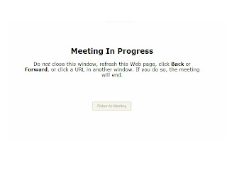
This eternal ambigous vexing message kept appearing for a long time and nothing else happened. the first time i assumed that meeting is actually in progress and asked the invitee to join it too. But to her it showed meeting not started. I tried to set up another meeting and waited for half an hour for it to start but nothing happened. It says if you close this window the meeting will end. Which meeting? the one that's not started yet? or is it started in a parallel universe?
and what is that perpetually disabled return to meeting button? Does this mean am I already in the meeting? Wher is a damn meeting dude?
Does anyone know a decent application for remote desktop viewing where i can take screenshot of the remote viewer, kindly let me know. Thanks!
Thursday, June 26, 2008
Monday, June 23, 2008
Great video on understanding social media
A simple ice cream example and how it grows and gains tags and recommendations.. Simple example to learn about how social media works.
Watch Here
Watch Here
Is QWERTY bad for typing?
Did you know that the QWERTY keyboard is designed to slow typing down?

In the earlier days when there were no keyboards and only typewriters, QWERTY was the common layout. It was designed for the typewriters. Prior to QWERTY there were a couple of experiments done but it was soon found that people became very efficient at typing and the wpm(words per minute) rose to an incredible number. Because of this the typewriter keys would jammed. Getting them straight again would waste time.
When keyboards came into being, it were the typists who first became its users. So the layout was kept the same. Nobody bothered to change it afterwords fearing its lack of acceptance. Hence we have inherited the QWERTY keyboard.
Problems with QWERTY?
Dvorak keyboard - An Alternative
Then came the Dvorak Keyboard patented in 1936 by Dr. August Dvorak, an educational psychologist and professor of the University of Washington in Seattle,William Dealey as an alternative to the more common QWERTY layout. It has also been called the Simplified Keyboard or American Simplified Keyboard but is commonly known as the Dvorak keyboard or Dvorak layout.

Although its not proved that this is a better alternative but 2 world records of maximum wpm has been broken using Dvorak. Some of its advantages are -
It was actually implemented by Apple Computers once in its iBook computers.


In the earlier days when there were no keyboards and only typewriters, QWERTY was the common layout. It was designed for the typewriters. Prior to QWERTY there were a couple of experiments done but it was soon found that people became very efficient at typing and the wpm(words per minute) rose to an incredible number. Because of this the typewriter keys would jammed. Getting them straight again would waste time.
When keyboards came into being, it were the typists who first became its users. So the layout was kept the same. Nobody bothered to change it afterwords fearing its lack of acceptance. Hence we have inherited the QWERTY keyboard.
Problems with QWERTY?
- Most frequently used characters are placed on the left of the keyboard whereas most people are right handed.
- Frequently used keys are placed so close to each other that it increases the chances of error.
- Increased learnability due to more left hand usage.
Dvorak keyboard - An Alternative
Then came the Dvorak Keyboard patented in 1936 by Dr. August Dvorak, an educational psychologist and professor of the University of Washington in Seattle,William Dealey as an alternative to the more common QWERTY layout. It has also been called the Simplified Keyboard or American Simplified Keyboard but is commonly known as the Dvorak keyboard or Dvorak layout.

Although its not proved that this is a better alternative but 2 world records of maximum wpm has been broken using Dvorak. Some of its advantages are -
- Study based on letter frequency and physiology.
- Letters should be typed by alternating between hands.
- Frequent letters should on the home row and under the strongest fingers.
- Least common letters should be on the bottom row.
- Right hand should do more typing.
- Diagraphs should not be typed with adjacent fingers.
It was actually implemented by Apple Computers once in its iBook computers.

Samorost - Detective Game

Play Here
This is a nice detective game where one has to find clues to move further.
Rack your brains and think laterally.
Join the dots and put 2&2 together.
Memex - Internet's first visualization in 1945 By V Bush
"The memex (a portmanteau of "memory extender") is the name given by Vannevar Bush to the theoretical proto-hypertext computer system he proposed in his 1945 The Atlantic Monthly article As We May Think. The memex has influenced the development of subsequential hypertext and intellect augmenting computer systems."
"Photocells capable of seeing things in a physical sense, advanced photography which can record what is seen or even what is not, thermionic tubes capable of controlling potent forces under the guidance of less power than a mosquito uses to vibrate his wings, cathode ray tubes rendering visible an occurrence so brief that by comparison a microsecond is a long time,... "
"Bush described the device as electronically linked to a library and able to display books and films from the library and automatically follow cross-references from one work to another."
"The physician, puzzled by a patient's reactions, strikes the trail established in studying an earlier similar case, and runs rapidly through analogous case histories, with side references to the classics for the pertinent anatomy and histology. ...There is a new profession of trail blazers, those who find delight in the task of establishing useful trails through the enormous mass of the common record."
Read the paper - As We May Think
Read about Vannevar Bush
Story telling and UI Design

What is the Similarity?
A story is a narrative of a sequence of events in a group of character's life. The story is the glue that binds the sequences together. Similarly the UI is what binds all the features together.
A story is a particular set of events that happen to a set of specific characters. The UI is a particular context of use for a specific set of target audiences.
A story flows from one set of events to another in a seamless and logical manner. Similarly in an intuitive UI the user moves from one screen to another in a seamless and logical manner.
In a story there are plots where all characters may be present and many plots where just two or three are present. In a UI there may be screens used by all in the audience and some screens used by a few of them.
The sequence of events are believable when they are likely to occur to the characters in the story. In UI the context of use is great when it actually matches the needs of its users.
The way a story is narrated brings a lot of interest and active participation in the audience. The way the UI is presented brings interest in its users.
A story is great when the people want to hear it again and again. Many other stories are based on the same plot. Popular UIs designs have always been copied and replicated to be used by all.
What are the dissimilarities?
The goal of a story is to entertain. The goal of a UI is to perform a task.
A story is linear, UI is non-linear. However UI does have a logical sequence of events.
How can we use Story for creating UI?
You can use aspects of story-telling to improve the UI. What story gives us is logical sequence of events, context of use, presentation and innovation.
When you create the personas for the UI detail out the personas using a story. Interaction of the persona and feature should be detailed out as a story that actually describes its context of use.
Sunday, June 22, 2008
A Realistic Desktop Interface
As desktop metaphor hasn't changes drastically since the 1970s this is certainly a bold step ahead.

The video
This is a neat and crisp prototype of a user interface using the desktop metaphor.

The video
This is a neat and crisp prototype of a user interface using the desktop metaphor.
- I like the 3d feel of icons after all 3d is more life-like for us.
- There is no concept of a folder rather a pile where objects are laid on top of each other just like we do it in the real world.
- However there a lot of gestures to be learnt to manipulate the objects around. These help the user to do actions like grouping the objects together, piling them them, etc. These gestures are somewhat intuitive so can be learnt soon.
- It also have a contextual menu that appear automatically on selecting which is great as it eliminates the right-click.
- A very interesting thing they have done is to treat images as 2d and file like word doc as 3d. Even in real life photographs are definitely thinner.
- There also a neat way to browse all the objects in a pile. The way we do it if have many books in a shelf.
- I think this is an interesting experiment as they have played with the affordances of objects.
- Also since the desktop metaphor hasn't changes drastically since the 1970s this is certainly a bold step ahead.
Saturday, June 21, 2008
Andriod- The Google Phone

A brilliant example of gesture and touch based input is the unlocking system of the Android. It detects the pattern created by the user's finger on the phone and if the pattern matches then it unlocks the phone. It actually uses the idea of sequencing with dots. So simple that an illiterate could use it!
Take a look this android like system
Thursday, June 19, 2008
Redesigning an ATM Interface
Introduction
In order to evaluate the usability of a system always judge how it performs for a typical usage. A few months back I presented in an HCI workshop for the benefit of engineering college faculties of Hyderabad. Usability is now being introduced at the graduation level and this presentation was an introduction to usability for these teachers. In the presentation I evaluated many systems for them, including an ATM Machine.
The pattern of evaluation was like this-
1. Identify the Usage Pattern of the Device or System
2. Evaluate whether the system facilitates the Usage Pattern
3. If not, then suggest improvements in design
Applying this to the ATM Interface
1. Identify the Usage Pattern of the Device or System
2. Evaluate whether the system facilitates the Usage Pattern
3. Improvements in Design
So here it is. There are many more things you can do once you sit and start thinking. These are only a few of them.
Actual Implementation
Wells Fargo has recently changed the design of their 7000 or so ATMs to make it more user friendly.
Read Wells Fargo ATM Redesign
In order to evaluate the usability of a system always judge how it performs for a typical usage. A few months back I presented in an HCI workshop for the benefit of engineering college faculties of Hyderabad. Usability is now being introduced at the graduation level and this presentation was an introduction to usability for these teachers. In the presentation I evaluated many systems for them, including an ATM Machine.
The pattern of evaluation was like this-
1. Identify the Usage Pattern of the Device or System
2. Evaluate whether the system facilitates the Usage Pattern
3. If not, then suggest improvements in design
Applying this to the ATM Interface
1. Identify the Usage Pattern of the Device or System
- Instant Cash Anywhere Anytime
- Quick and Easy cash
- For anyone literate or illiterate
- Most of the time amount withdrawn is the same
- Language chosen is same everytime
- Account time for a card is the same.
2. Evaluate whether the system facilitates the Usage Pattern
- ATM does not identify the account - Once the user enters the pass-code the system asks the user to select an account. But to my knowledge a card can be linked to only one account.
- It does not remember things - The user specifies the same language everytime. Why does not the ATM get it once and for all.
- Does not consider the typical usage - The user is got the habit of withdrawing the same amount over 90% of the time, so it should allow for dispensing that amount(checking from transaction history) at the click of a single button rather than having the user to enter the amount again (3 or more keystrokes).
- No prior notice of money finishing - There is always a queue that shifts from one ATM to another when the money gets over. Instead if a prior warning is given then users can find alternate means to take out money instead of wasting time in the queue.
- Does not simplify things - I have seen in many ATMs that in order to withdraw money, the ATM asks you to enter the amount to 2 decimal points, like 500.00. Will the ATM take out 50 paise if I do fill it?
3. Improvements in Design
- Adapt to the common scenario - The longer the process the harder it is for the user. So ask only what you wouldn't know at that point.
- Ask one time preferences only once -Language is one such thing.
- Simplify the Process - Identify the usage pattern and keep it as the default settings
So here it is. There are many more things you can do once you sit and start thinking. These are only a few of them.
Actual Implementation
Wells Fargo has recently changed the design of their 7000 or so ATMs to make it more user friendly.
Read Wells Fargo ATM Redesign
Wednesday, June 18, 2008
Science of Interruption
A good article on this very different field of psychology that studies attention deficit problems in users.
"Information is no longer a scarce resource - attention is.... Computer-based interruptions fall into a sort of Heisenbergian uncertainty trap: it is difficult to know whether an e-mail message is worth interrupting your work for unless you open and read it - at which point you have, of course, interrupted yourself. Our software tools were essentially designed to compete with one another for our attention, like needy toddlers."

Tuesday, June 17, 2008
Banking Exercise
Dear Visitor,
Please complete the exercise and add your valuable inputs to the design of banking sites. As part of this exercise, you have tell the suitable location of the following objects in the grid below. The grid is for saving account online. You see this screen first thing when you log into your account. The objects are -
1. Account Balance
2. My Recent Transactions
3. Reward Points Accumulated
4. Pending Transactions
5. New Offers and Schemes
6. Link to other related accounts
7. Ads
8. Local Navigation
The Grid -
Please write the location numbers again each item in the comments section of this entry.
Thanks for your help and time! :)
Please complete the exercise and add your valuable inputs to the design of banking sites. As part of this exercise, you have tell the suitable location of the following objects in the grid below. The grid is for saving account online. You see this screen first thing when you log into your account. The objects are -
1. Account Balance
2. My Recent Transactions
3. Reward Points Accumulated
4. Pending Transactions
5. New Offers and Schemes
6. Link to other related accounts
7. Ads
8. Local Navigation
The Grid -

Please write the location numbers again each item in the comments section of this entry.
Thanks for your help and time! :)
Remembering Passwords
Q)How does one remember something?
A) When the mental artifact shifts from the STM (Short Term Memory) to LTM (Long Term Memory).
How does this process happen? One of the ways is through mugging. Now all of us are not smart enough to mug all the time. So when we encounter the artifact again and again in our tasks it gets imprinted in our minds eventually.
For Instance, they teach you in school that the capital of France is Paris in grade 1. You may or may not remember it. Maybe you remember it for the tests but then you forget it. So in grade 2 you encounter the same piece of information again. And again in the third grade. So finally it registers in the mind that the capital of France is Paris.
Forgetting Password
Similarly with Passwords. For the Accounts that you check more regularly the passwords are easier to remember because you encounter that piece of information everyday and hence you 'Remember' it. For accounts that you do not access frequently, the passwords are not remembered. Specially the accounts that you check once in 2 months or more. More so because you have many accounts online each with different usernames and passwords.
As a result, users forget their passwords. Now comes the usability issue. What many sites do is generate a new one instead of sharing the old one on the pretext of more security. This means that the user has now to remember a new piece of information. So sending him a new password as initiated a new cycle of forgetfulness. It has not helped the user remember it. This is because the user does not encounter the same piece of information for him to remember. Instead he has the challenge of remembering an altogether new piece of information.
Remembering Password
Instead the user should help the user encounter the same piece of information to the user by either giving him hints or mailing him his password. This ensures that the user eventually remembers his password. The users can delete the main containing the password immediately after getting the password is security is such an issue.
When user does not remember passwords, he tends to note it down somewhere which is again a huge security breach. Instead its best the user remembers the password. We should therefore take steps towards making the user remember his password.
Analysis of 2 rupee coin
The new 2 rupee coin glistened under the KFC lights and as I took a closer look at its over simplified imagery and smooth form it looked unlike any other Indian coin I ever saw. To test its unique design would be great fun.
And so it begins, the experiment to know how usable the new design was.
Me: So here's a bag that contains different coins and kindly pick up a 1 rupee coin in 5 sec.
Subject A: (Moving hands in the bag) Here it is.
Me: Thanks, who is next?
After testing with half a dozen subjects, the results showed that 1 rupee coin was taken out successfully only half of the time and the in the rest of the cases it was the brand new 2 rupee coin that took its place.
A similar experiment followed with a 5 rupee coin with 100% success rate.
As we analysed why it happened,
We realized that the subjects while hunting for the 1 rupee coin, felt for smooth texture, lighter weight and limited thickness.
The premise for conducting such an experiment was to enact the real life example of taking coin out in a jiffy say while paying back to the auto fellow who is dying to leave, a crowded supermarket where people behind you are waiting in the queue, in a bus where you cannot let go of the handle bars for too long to pay the money for the ticket, etc. Coins are always given in a hurry also pertaining to its low currency value. So then fundamental charcteristics of shape, texture, weight and volume come into play very significantly.
So we placed a 1 rupee, the new 2 rupee and old 2 rupee coins on my palm with their backs upside and asked people around to tell me the currency on each one of them. They all gave correct answers for the 1 rupee and the old 2 rupee coin and but but not for the new 2 rupee coin. Besides the reason that it was new and wasn't very familiar to people, the new 2 rupee coin was hardly distinguishable from the 1 rupee coin. Also how is a visually impaired person supposed to make it out from the old 1 rupee coin? How are the millions of illiterate people we have in our country supposed to make it out from the old 1 rupee coin ?
So what goes in while designing a good coin?
Very fundamental things like size, shape, color, texture, weight, etc. All the factors that identify it in less that a second. Things where people don't have to read the text on the coin. Something that is accessible to everyone.
So let's start making life simple starting with the small things in life.
Subscribe to:
Posts (Atom)